

Bootstrap, Foundation, UIKit - An Agnostic Comparison
It's a technological struggle where everything is at your finger tips yet we seek convenience and accessibility in all walks of life. This reminds me of…
There are three roads to ruin; women, gambling and technicians. The most pleasant is with women, the quickest is with gambling, but the surest is with technicians.
~ Georges Pompidou
There's an enlightening TED talk by Dr. Barry Schwartz (Psychologist) titled — The Paradox of Choice where he reaches a thought provoking estimation in his own fun rhetorical way that:
The more choices people have, the more freedom they have, and the more freedom they have, the more welfare they have. This, I think, is so deeply embedded in the water supply that it wouldn't occur to anyone to question it. And it's also deeply embedded in our lives. Choices have not made us more free but more paralysed, not happier but more dissatisfied.
Escalation of expectations: This hit me when I went to replace my jeans. I wear jeans almost all the time. There was a time when jeans came in one flavor, and you bought them, and they fit like crap, they were incredibly uncomfortable, if you wore them and washed them enough times, they started to feel OK. I went to replace my jeans after years of wearing these old ones, and I said, "I want a pair of jeans. Here's my size." And the shopkeeper said, "Do you want slim fit, easy fit, relaxed fit? You want button fly or zipper fly? You want stonewashed or acid-washed? Do you want them distressed? You want boot cut, tapered, blah blah." On and on he went. My jaw dropped. And after I recovered, I said, "I want the kind that used to be the only kind."
The reason that everything was better back when everything was worse is that when everything was worse, it was actually possible for people to have experiences that were a pleasant surprise. Nowadays, the world we live in -- we affluent, industrialized citizens, with perfection the expectation -- the best you can ever hope for is that stuff is as good as you expect it to be. You will never be pleasantly surprised because your expectations, my expectations, have gone through the roof. The secret to happiness -- this is what you all came for -- the secret to happiness is low expectations.
~ Excerpts from "The Paradox of Choices"
(Attribution: TED - Ideas worth spreading and Dr. Barry Schwartz)
Speaking of choices than you can experience overwhelming choices on online market places like ThemeForest, Creative Market, Elegant Themes, and ThemeIsle where avid users can buy a sub-standard theme; maybe based on one of these responsive frameworks to swim in a fish bowl year after year and ponder over customizations i.e. how I can fit into these pair of jeans? I'm choosing not to answer this question and moving on to the part where you can tailor make your own pair of jeans i.e. Development - In any project development lifecycle putting preference on creating or building your own stuff may seem redundant at times but it does pay off. The shift comes when a commercial theme based on a popular framework seems more practical and it ought to be the magical unicorn or the irish leprechaun which means you're high, smoking crack and apparently seeing rainbows.
Consider this an agnostic comparison gained from experiences while working closely on these frameworks. They all boast advanced features so there can't be an actual benchmark for each framework has its own flaunting set of features, grids, components, community, download size and so on. Beginning with:
Twitter Bootstrap
Probably the most popular and highly admired responsive grid framework envisioned by Twitter developers Mark Otto and Jacob Thornton in the year 2011 when responsive development was kicking off. First released in August 2011 under Apache 2.0 license it received accolades from numerous development community. Some interesting statistics on Bootstrap:
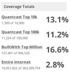
As of September 2016 - Source @ BuiltWith
Clearly, Bootstrap is winning the Web despite it's shortcomings like CSS3 animations, block grids, form elements styling, datepicker, timepicker (could be more) and not very long ago it was packaged only with LESS preprocessor. Bootstrap 4 is on the horizon - that may bring something more on the table. Let's go with a front to front list of features and components of Bootstrap.
Cheers!
- Mobile First
- Responsive Grids
- Columns (L, M, S, XS)
- Resets, Offsets, Push & Pull
- Visibility Classes
- Glyphicons
- Dropdowns
- Button groups
- Button dropdowns
- Input groups
- Navs
- Navbar
- Breadcrumbs
- Pagination
- Labels
- Badges
- Jumbotron
- Accordion
- Page header
- Thumbnails
- Alerts
- Progress bars
- Media object
- List group
- Panels
- Responsive embed
- Wells
Boo Hoo!
- SCSS support (Old versions)
- Extra large media size
- Flex grid
- EM Conversion (Elastic measurement)
- Collapsing grids
- CSS3 animations
- Block grids
- Form element styling
- Datepicker
- Timepicker
- Too much verbose styling
- Semantic customization
- Clean code
- Default base font size set to 14px (87.5%)
There may be more but let's take a pause for a cause and look back at what strikes a framework as rational choice? It should be mobile first, modular, cross browser compatible, cross device compatible, should have comprehensive UI components for fast prototyping and a big bonus if you could semantically customize each component which is a big limitation in Bootstrap. If you're building large applications/websites than you'll have to deal with lots of bloated code which maybe unused in DOM.
Verdict:
Bootstrap is any developers choice, widely used in hybrid mobile apps, web apps and responsive websites, but its impaired when greater control is required over markup, bandwidth savvy CSS, in fact it never strikes an average developer to overlook beyond popularity. This may well mean increase in payload and bandwidth which may or may not affect overall performance.
SCORE:
Moving ahead with another colossal framework Zurb Foundation.
Zurb Foundation
Released in the same year 2011 by Zurb when responsive design and development was still in a nutshell this is one of my favourite frameworks for it's sheer library of components, semantic styling, quick prototyping, CLI wrappers, and SaSS support. Starting with Foundation 4 this was my first framework of choice to migrate on responsive development. It has since evolved into three separate platforms Foundation for Sites, Foundation for Emails and Foundation for Apps. Foundation has implanted itself into responsive development realm since then. Statistically Foundation ranks at:
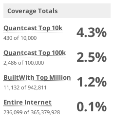
As of November 2016 - Source @ BuiltWith
According to Google Trends comparision on Bootstrap,Foundation,UIkIt Foundation is taking lead by a vague lineage count and needs to be deferred.
Foundation opens up new possibilities for front-end development in creating custom grid base, grids, push/pull, offsets and media queries which are embedded within the core of Foundation in form of mixins and functions. Let's take a look at some of them grid-row, grid-row-nest, grid-column, grid-column-size, grid-column-position, grid-column-offset, grid-column-row, grid-column-collapse, grid-column-uncollapse, foundation-grid, grid-layout, grid-layout-center-last and many more. It's remarkable to have your own grids and components initialized semantically excluding any extra CSS payload which is very critical when up-sizing your applications/websites for page speed and bandwidth.
If you dig deeper in to Foundation core library, you may find some more interesting mixins and functions that can be used even outside Foundation scope like the css-triangle, hamburger, background-triangle, clearfix, vertical-center, horizontal-center, absolute-center, text-inputs, rem-calc and since Foundation 6 you get Flex layout mixins and functions. If I were to choose between Foundation and Bootstrap, I would choose Foundation. Let see what Foundation has to offer:
Cheers!
- Mobile First
- Responsive Grids
- Flex Grids
- Collapsing Grids
- Columns (L, M & S)
- Resets, Offsets, Push & Pull
- Visibility Classes
- FontAwesome
- Dropdowns
- Button groups
- Button dropdowns
- CSS3 Animations (MotionUI)
- Top Bar
- Navigation Menus
- Dropdown Menus
- Accordion Menus
- Drilldown Menus
- Off-Canvas Menus
- Navigation Helpers
- Breadcrumbs
- Pagination
- Labels
- Badges
- Orbit
- Thumbnails
- Alerts
- Progress bars
- Responsive Media Embeds
- Block Grids
- Tooltips
- Abide Form Validation
- Equalizer
Boo Hoo!
- LESS support
- Datepicker
- Timepicker
- Missing few semantic components
- IE legacy support
- Steep learning curve
- Support & Community
Frankly, these are the only drawbacks in Foundation that I could think of. If you are a neckbeard than this framework will make it to your top list; in respect to framework size and flexibility Foundation surpasses Bootstrap/UIKit with shining colours.
Verdict:
Foundation is not as popular as Bootstrap but it's ideal for RWD, fast prototyping, building responsive websites and hybrid mobile applications.
SCORE:
UIKit next on comparision.
UIKit
Created by YooTheme in the year 2013 primarily emphasized for responsive Wordpress and Joomla development this is one of the most underrated responsive frameworks that is light-weight, modular, supports both LESS and SaSS pre-processors and boasts impressive set of features and components with CSS3 animations. UIKit is no code bloat, no non-sense and no-steep learning curve framework; although a rising star it shacks some interesting components like Dynamic Grid, Parallax Grid, Dynamic Pagination, Form Input Components, Autocomplete, Datepicker, HTML Editor, Sliders, Parallax, Notify, Search (JSON), Nestable, Sortable, Timepicker and Upload. You get a Datepicker and a Timepicker yes! and many more fun components which can make your life so much easier. Supporting media sizes from Mini <= 479px, Small >= 480px & <= 767px, Medium >= 768px & <= 959px, Large >= 960px & <= 1199px and X-Large >= 1200px almost covering all devices.
UIKit is the only framework that can be extended with hooks or API's unlike Bootstrap or Foundation which are extended with semantic initialization. No wait there's more; an added bonus - you can even define multiple styles for your theme. Now how cool is that? You don't touch the source files or semantically initialize it but still be able to quick prototype and experiment. Statistically it has not received much attention like Bootstrap or Foundation, so let's see where UIKit stands in this race:
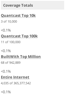
As of December 2016 - Source @ BuiltWith
Its still a noteworthy framework packed with add-on components, template styles, variables and a customizer to provide quick and easy prototyping. Built on the principals of modern responsive web standards and leveraging CSS3 animations its an ideal framework for developing eye-catching responsive websites and hybrid mobile applications. Since UIKit version 2.27 it does weigh at whopping 2.3 MB (uncompressed) with all components which is way more than Bootstrap or Foundation. Evidently you can customize, tweak, use CDN and fine-tune your configuration to narrow it down under reasonable size depending on your project size and requirements. UIKit offers:
Cheers!
- Mobile First
- Responsive Grids
- Flex Grids
- Collapsing Grids
- Columns (XL, L, M & S)
- Resets, Offsets, Push & Pull
- Visibility Classes
- Form Components
- FontAwesome
- Dropdowns
- Button groups
- Button dropdowns
- CSS3 Animations
- Nav Bar
- Subnav
- Dropdowns
- Navigation Helpers
- Breadcrumbs
- Pagination
- Labels
- Badges
- Slider
- Thumbnails
- Notify
- Progress bars
- Responsive Media Embeds
- Tooltips
- Parallax
- Datepicker
- Timepicker
- Dragabble, Sortable & Nestable
- Autocomplete
- HTML Editor
- Overlays
Boo Hoo!
- 10 grid base
- Unit division grid
- EM Conversion (Elastic measurement)
- Framework size
- IE legacy support
- Support & Community
The 10 grid base and unit division can be confusing and discouraging if you're accustomed with 12 grid columns. UIKit lags those mixins, functions or variables to define custom grid base, instead define hooks to create custom grid base and write your own code for grids, push, pull, media sizes and offsets. Refer to this Github issue for more @ https://github.com/uikit/uikit/issues/217. UIKit 3 beta is on its way housing more powerful features and components checkout preview UIKit 3.
Verdict:
UIKIt is the contemporary framework packed with awesome features and components but on a serious note it's not easy to work with 10 grid base and unit divisions since the inception of responsive grid system was based on 12 columns and 960px container.
SCORE:
Reaching ‘finale’ with winners and runners-up this should give a hands-on take on modern responsive CSS frameworks. Irrespective of which framework you choose there's always some learning curve and framework precedence is a drift between your skills, regimen, contentment, project size, and time constraints. What seems easier in Bootstrap might take a while in Foundation or UIKit. While UIKit will blow you away with rich components and CSS3 animations you may miss them in Bootstrap or Foundation.
More resources to lookout for: